UX Case Study: A new feature to keep fit with friends during COVID-19
A concept group project for MapMyFitness
Overview
Timeline: 2-week sprint
Team: 4 designers
For the first group project on the General Assembly UX Immersive course, I was in a team with three classmates. We used the double diamond process moving through four stages: Discover, Define, Develop and Deliver.

The Brief
During the pandemic, the home fitness sector was undergoing a boom. MapMyFitness (MMF) saw this as an opportunity and wanted to enable their users to take part in remote home workout videos.
Users should be able to:
- Work out with friends
- Choose from a range of workouts
- See both the instructor and the people they’re working out with
- Customise the experience (i.e. change view/mute)
- Communicate with each other during the workout
After much deliberation, we decided to focus on the desktop version, as an app screen would be too small to see both the instructor and the users friends.
As a team, we created a project canvas. Filling this in was a great way to make sure the whole team understood the brief and enabled us to discuss our initial thoughts and assumptions.

Discover
Competitor analysis, user interviews and screener surveys
During the research phase, we agreed to split up the tasks. My colleague and I wrote the interview script and questions, whilst my other teammates worked on the competitive analysis and the screener survey. After which we all came together and discussed, critiqued and iterated all these activities.
Competitive Analysis
By doing a feature analysis, we could compare which features the competitors were offering. These gave us some initial ideas on features we could potentially implement to meet the brief.

User Interviews
I conducted four user interviews, and as a team, we did 16 in total. The focus was to understand the users exercise habits. It was especially valuable to know how these habits differed during the Covid-19 lockdown period. To categorise and synthesise all this qualitative data, we created an affinity map.

Some of the key findings were:
- People were exercising more due to being in lockdown
- Mental health and stress release were huge motivations for exercise
- People enjoy exercising with other people
Screener Survey
I sent the survey to my network to find target users we could contact for user testing. Surveys are also a great way of collecting valuable quantitative data, but we came across some surprising insights.
- 75% said they either wouldn’t or were not likely to pay for an exercise class
- 50% said they prefer to work out alone
This data was contradicting our user interview insights and our brief.
If I had more time, at this point, I would have suggested interviewing more users to get a better understanding of what their needs were. This could have resulted in needing to discuss these findings with our client, and amend the brief based on the new data.
Define
Persona, problem statement, experience map, ‘how might we’ statements, site map and user flow
Persona
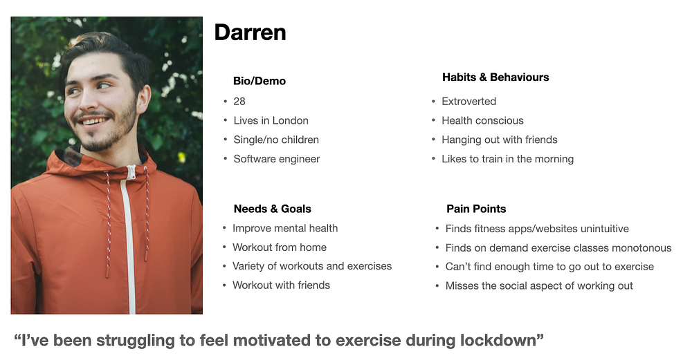
With all the data from the user interviews and the survey, we created a persona. We felt this was important to do as a team, as even though we shared our user interview insights, it was crucial that our persona aligned with the key user needs, goals and pain points.
Creating a persona helped me stay focused on solving the user's problems.
Problem Statement
Darren needs a way to reduce stress and connect with others because he has been isolating at home due to lockdown.
Experience Map
So in what context would Darren be experiencing this problem? As a group, we created a user journey and task analysis. Then plotted his emotional state at each stage.
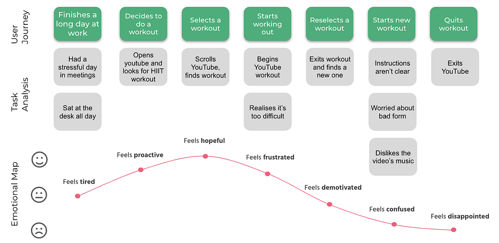
Now I had a good idea of how the problem was affecting Darren. We individually wrote some ‘How might we’ (HMW) statements and discussed which three most aligned with the problem we needed to solve.
How Might We’s
1. How might we retain the social element of working out within a virtual class environment?
2. How might we encourage and motivate users to push themselves?
3. How might we ensure our users are well educated on the exercises to promote safety?
Site Map
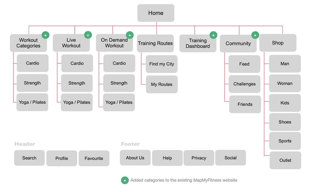
The brief stated that we need to integrate any new features into the existing site. This site map shows the current content structure and the green symbols highlight the new pages we were adding.
User Flow
Now the information architecture was mapped out; I created the user flow to understand how Darren would navigate the site when joining an exercise session.

Develop
Design studio (sketches), feature roadmap and low-fidelity wireframes
Design Studio
As a team, we did a design studio for each HMW. Each round consisted of sketching feature ideas for 10 minutes to solve that particular problem. We then used dot voting to choose different features that we thought would add the most value for Darren.

Low-Fidelity Wireframes
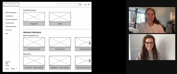
I sketched four (out of eight) screens, incorporating the features voted for in the design studio.
I then tested the sketched wireflow and put the insights on sticky notes, this meant as a team we could discuss which changes we should implement. It became clear we could remove two of the pages, as they didn’t add any value to Darren's experience.

The pages I was responsible for were:
- The workout details page
- The safety pop up (added later)
- The working out page
Deliver
Usability tests, iterations and high-fidelity prototype
Usability Tests and Iterations
We did 16 usability tests, of which I did four.
Workout details page iterations:
- Users struggled to find out how to join a workout, so I made the button and text bigger
- Users were feeling overwhelmed at how much optional equipment was shown, so I reduced these to two
- Users were confused about why there was a back icon on a desktop screen, so I removed this

Working out page iterations:
- Users assumed the ‘exit class’ button was in the bottom right corner, so I moved it there as this was more intuitive
- Users said they wouldn’t use the chat feature during a workout (this further clarified the data from the survey), so I removed it
- Users wanted to see the time more predominantly on the screen, so I moved it to the top, centre
- Users felt the ‘list view’ icon was not intuitive, so I made a new icon and re-named it ‘change view’ to better describe this feature

High-fidelity prototype
Next Steps
As this was only a 2-week sprint, we didn’t have enough time to implement all the chosen features. So here are the key next steps I would take:
- Design the onboarding screens
- Add more features
- Add accessibility icons for workouts
- More user testing
Reflection
During this project, I developed my team working skills by actively listening to others and exploring ways to compromise whilst meeting the user's needs. On reflection, I would change the colour palette to softer colours such as navy, to promote inclusivity.
Thanks for reading. If you have any questions or want to reach out, you can find me on LinkedIn.
