Rebrand and Reskin a Charities Responsive Website
Visual design concept project in a 4-day sprint.

Overview
I redesigned two pages of a charities responsive website during the second visual design project on the General Assembly UX Immersive course. I completed this project in a four-day sprint.
The Brief
- Choose a charity (from a list of 5)
- Reskin and rebrand the homepage and one other page (for mobile, tablet and desktop)
- Use the mobile-first approach
The charity I chose was The Emily Harris Foundation. This is a foundation that supports a neonatal care unit, but also its staff and the families whose children are being cared for there. After researching the foundation, I felt drawn to this project and its meaningful work. During my previous childcare roles, I have been lucky enough to share some amazing moments with families. One that stands out was welcoming a newborn baby home for the first time. Reading about this foundation reminded me that not all families are lucky enough to share these same experiences.
It was hard to choose the secondary page to redesign, as the whole website needed a revamp, but I settled on the donation page. It surprised me that this website's core goal is for people to donate, yet it’s difficult for users to know how.


Branding
Brand values, tone of voice and word associations
Brand Values
I started the rebranding process by looking at how I could define the brand and identified some keywords aligned with the foundation.
- Caring
- Supportive
- Thoughtful
- Contribution
- Nurturing
I then thought about where the brand should be positioned:
- More gentle than strong
- More colourful than monotone
- More accessible than exclusive

If the foundation was a person, how would they sound? What kinds of things would they say? I explored this by thinking about the tone of voice. To articulate this, I wrote the following statement:
We are a caring and supportive charity who combine sensitivity and understanding to those who need us. We strive to give families a helping hand and to show that they’re not alone.
To further define the brand, I wrote some goldilocks statements:
- Caring but not suffocating
- Supportive but not smothering
- Thoughtful but not obsessive
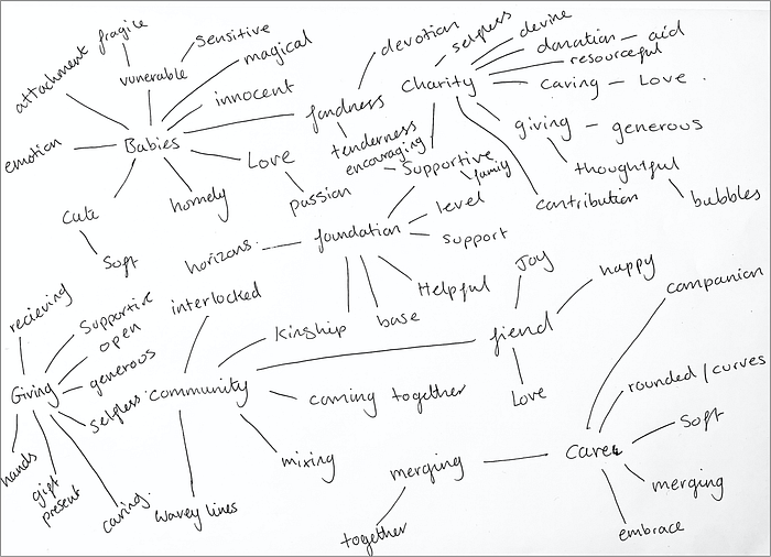
I created a word association map to explore the wider context around the brand values. The keywords that stood out to me were:
- Soft
- Rounded/curves
- Happiness
- Coming together
These words symbolize nurturing, joy and compassion, which brought me back to the core of what the foundation represents.
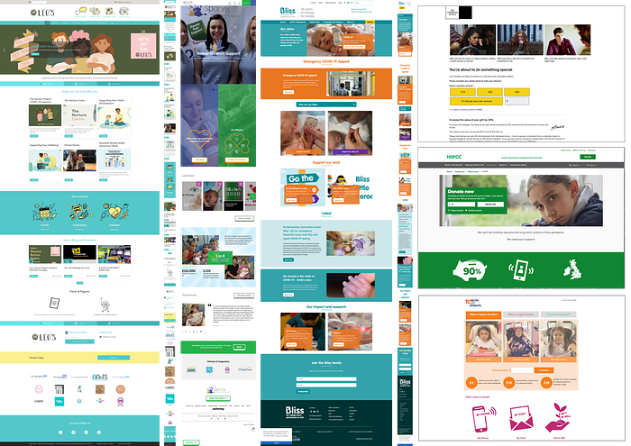
Competitive Research
To see what similar charities were doing on their website, I did some competitive research. By analysing direct competitors, such as other neonatal and children charities, I could sense the market's UI norms. When going through these sites, I thought about these factors:
- Is the visual design appropriate for this charity?
- Did it evoke the charities values?
Some key things that stood out were that the competitors…
- Used bright colours
- Often put text and words over pictures
- The donate call to action was at the top of the page
- They used a lot of icons
Visual Ideation
Moodboard, logo and style guide
To start visualizing the keywords, I sourced some design-led images and created a mood board.

Developing the Logo
I first looked at the current logo and wondered how I could use the rainbow and revamp it to make it more joyful. I sourced some rainbow images and played around with the saturation and brightness. After contemplating these for a while, I felt they did not align with the thoughtful and nurturing brand values. So I wanted to go for a more modern and simple feel. I settled on the babies footprints, for their simple design and soft, calming dusty pink hue.

I could now use the images in the mood board, and the logo, as a guide when creating the colour palette. Using the colour picker in Sketch, I picked out the exact colours and adapted them to ensure there was enough contrast.

I chose a sans serif typeface to promote a softer and informal feel. This means users can sense that this is a friendly, welcoming website.
Design
Wireframes and iterations
Now it was time for my favourite part of the process — the design and iterations! I sketched out some low fidelity wireframes, and during our daily critique, I got some valuable feedback that I used to iterate.
Critique insights on the homepage on mobile:
- Not necessary to have the full foundation name on the mobile screen
- The Burger menu is more user friendly to have on the left side
I added a description, moved the logo into the centre and the burger menu to the left side.
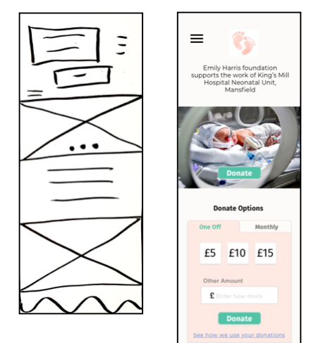
Critique insights on the Donation page on mobile:
- The ‘how your donations help’ section was more important than the article
- The background colour of ‘how your donations help’ was too dark
I changed the hierarchy by moving the article below the donation information. I also removed the dark background colour and instead used that colour for the icons.

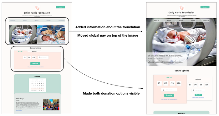
Critique insights on the Donate page on desktop:
- It was not clear what the foundation was about when entering the site.
- The ‘donation options’ felt stretched.
I added a description of the foundation, so users could see it as soon as they entered the site. I also made both ‘one-off’ and ‘monthly’ donation options visible; this made better use of the desktop width.
Final Screens and Prototype

Next Steps
- Add breadcrumb navigation
- Create a prototype with the high fidelity wireframes
- Do usability testing and iterations
- Accessibility testing on the colours
Reflection
I learnt a lot, and I‘m proud of what I achieved in such a short sprint. My favourite part was learning all the techniques, such as brand positioning and colour theory. I would be keen to re-skin other responsive websites and spend more time delving into these new skills. I want to explore how visual design affects the user's experience. I find this area fascinating.
