Designing an e-commerce website for The Little Worlds Toy Shop
A conceptual UX project, where I worked on a brief for the first time.

Overview
Timeline: 2-week sprint
Team: Solo, with group activities
For the second UX project on the General Assembly UX Immersive course, I designed an e-commerce website. This was a conceptual brief for a made-up company called The Little Worlds Toy Shop (LW). I was in a group with four other classmates who also had the same brief. We worked as a team during the research phase and shared our findings and insights. The rest of the project I did solo.

The Brief
- A little store with a big heart
- “We want to maintain our ‘small shop’ appeal and excellent customer service.”
- “Through a new e-commerce website, we want to showcase our products while maintaining our brand image.”
- “We offer a highly curated inventory, focusing on hand-picked quality over quantity.”
Research Phase
Competitor analysis, user interviews, and card sorts
To start the Research phase, we looked at some direct competitors, from global toy retailers to a small independent London based toy shop. We also looked into an indirect competitor, meetup.com, to see how they incorporated the community into their website. This was an important area for LW’s because the community is a vital part of their brand.

As a group, we conducted five user interviews. Here are some of the key insights:
- Age filters make it easier to find age-appropriate toys
- Users want to see product specifications, e.g. dimensions
- Evidence of the quality of the toys is essential
Using these insights, I created a persona to make sure all my design decisions were directly meeting the target user's needs.

As a group, we conducted 12 open card sorts. We did this to understand how users would intuitively put LW’s inventory into groups. The results showed that users had chosen 47 different categories, so we had to synthesise!

Synthesising the Qualitative and Quantitative Data
To break these 47 categories down, I created a chart to see the most popular groups. I then conducted a closed card sort to see which items were left and which categories were missing.

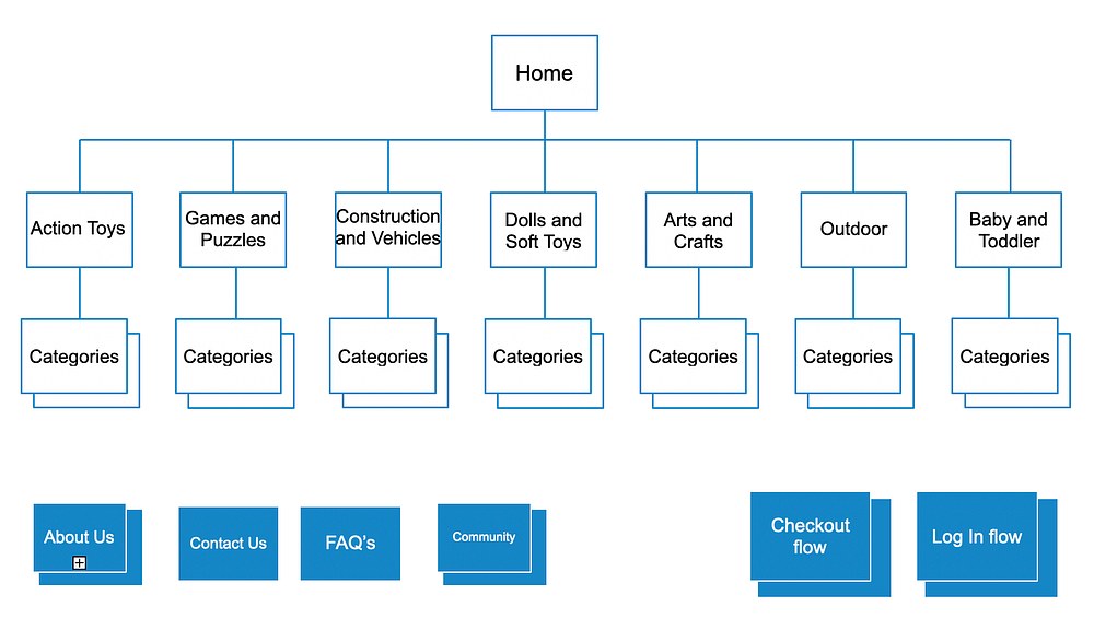
So how will these categories fit into the information architecture on LW's website? I created a sitemap to map out the hierarchy of the content.
So what does Sarah want to do on the LW’s website?
Scenario: Sarah and her children have been invited to her best friends daughter’s 7th birthday party next weekend, and needs to buy an age-appropriate gift.
To determine how Sarah could navigate her way through the site whilst completing her goal, I created a user flow (Sarah’s happy path).

Design Phase
Ideation, wire flows, and iterations
Now with a clear idea of how Sarah would navigate through the website; I moved onto the design phase. I sketched out the happy path screens and tested them to see whether the layout was intuitive.

Based on the user test insights, I made some iterations and created low fidelity (lo-fi) digital Wireframes on Sketch.
With the digital wireframes, I did 4 usability tests and asked them:
Can you show me how you would go about buying a board game for a 7-year-old?
I did 2 rounds of testing and iterating, moving the lo-fi wireframes into mid-fi. Here are some key iterations I made, and the key insights that led me to make those changes.

Homepage Iteration
One key finding was that users felt it was unintuitive to click on the global navigation and then be taken straight to another page. So in this first iteration, I added a drop-down so users can see the categories before being taken to a different page. This enabled users to find what they were looking for quicker.

Sign In Page Iteration
When users clicked on ‘checkout’, it took them to another page to sign in. This was not intuitive and did not allow the user to exit the checkout process and continue shopping easily. I created a pop up for the sign-in details over the basket page, where users can exit or click out of the pop up to go back.
Prototype
Due to time constraints within the course, the brief was to do the whole UX process without the visual design.
Click here for prototype on InVision.
Next Steps
- Increase fidelity by adding visual design and content
- To undertake more user testing and then iterate
Key Learnings
- Working in a team - As this was our first project working (partially) in a team, we got off to a slow start. We wasted valuable time deciding how to go about the research, as no one wanted to take the lead. This was a great learning curve for me, and I have since taken on a facilitating role within group projects if the progress slows.
- Asking questions during usability tests - I was able to dig deeper and get more valuable insights when asking the users questions.
Thanks for reading. If you have any questions or want to reach out, you can find me on LinkedIn.


